




Visual Identity
Texture
The Project
Texture is building the future of capital markets. It's a FINRA-member broker-dealer in New York, and since 2019 it has been putting in place the regulated rails that let securities and real-world assets trade on blockchains.
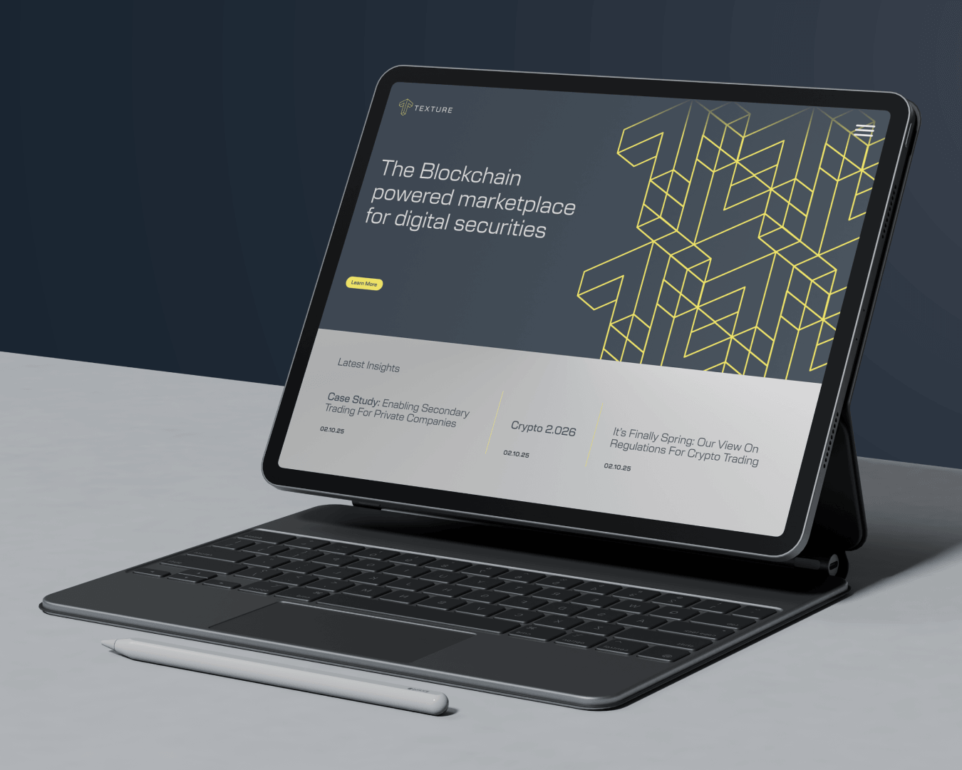
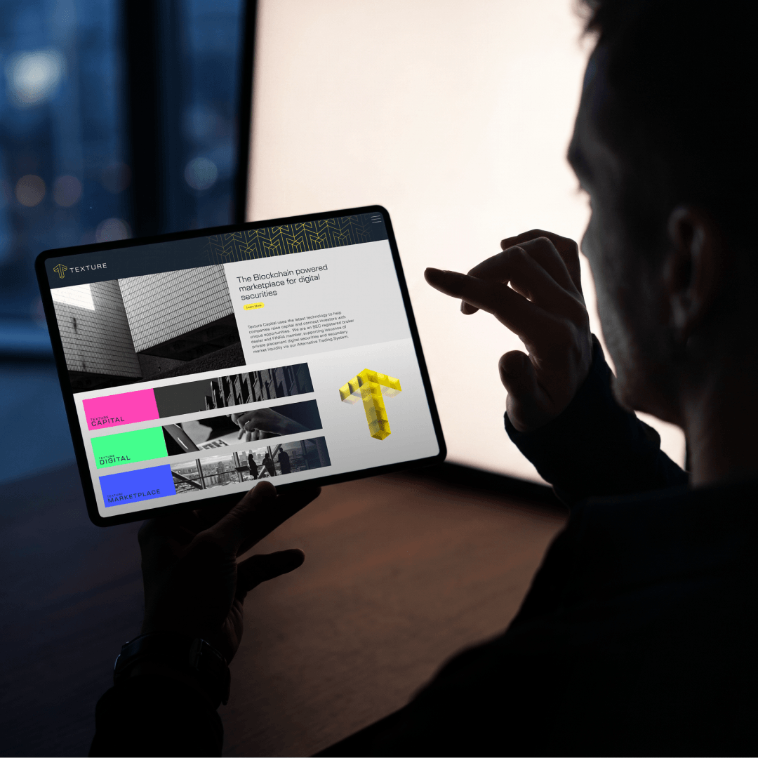
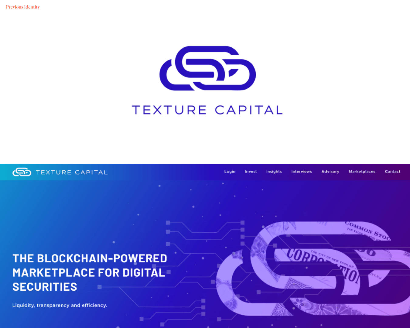
The business was moving fast, and its brand hadn't kept up. Texture brought us in to sharpen its positioning, rebuild its identity and launch it across its website, giving the brand the same ambition as the company.
Roles
Brand Strategy, Positioning, Visual Identity, Messaging, Digital Design

Brief
Texture had three problems to solve. The first was credibility in two worlds at once: the brand had to reassure compliance teams and institutional investors without putting off a crypto-native audience. The second was standing out in a category where most tokenisation brands look the same, all gradients, glowing nodes and abstract concepts. The third was bringing a growing set of services together under one clear, confident brand, so that the broker-dealer, marketplaces, transfer agent and new products all made sense together.
Strategy
We spent time with the leadership team to understand how Texture works in practice and where it sits between two industries that often talk past each other. One thing kept coming up. Texture's real advantage was the rigour: regulation, record-keeping, to ensure it was creating a market done properly.
That shaped the positioning. Texture isn't crypto dressed up as finance, and it isn't finance cautiously dabbling in crypto. It is the regulated bridge between traditional market infrastructure and on-chain finance, rebuilding market structure on new rails without dropping the rules that make markets trustworthy.
Identity
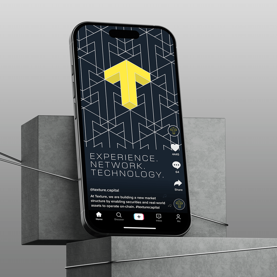
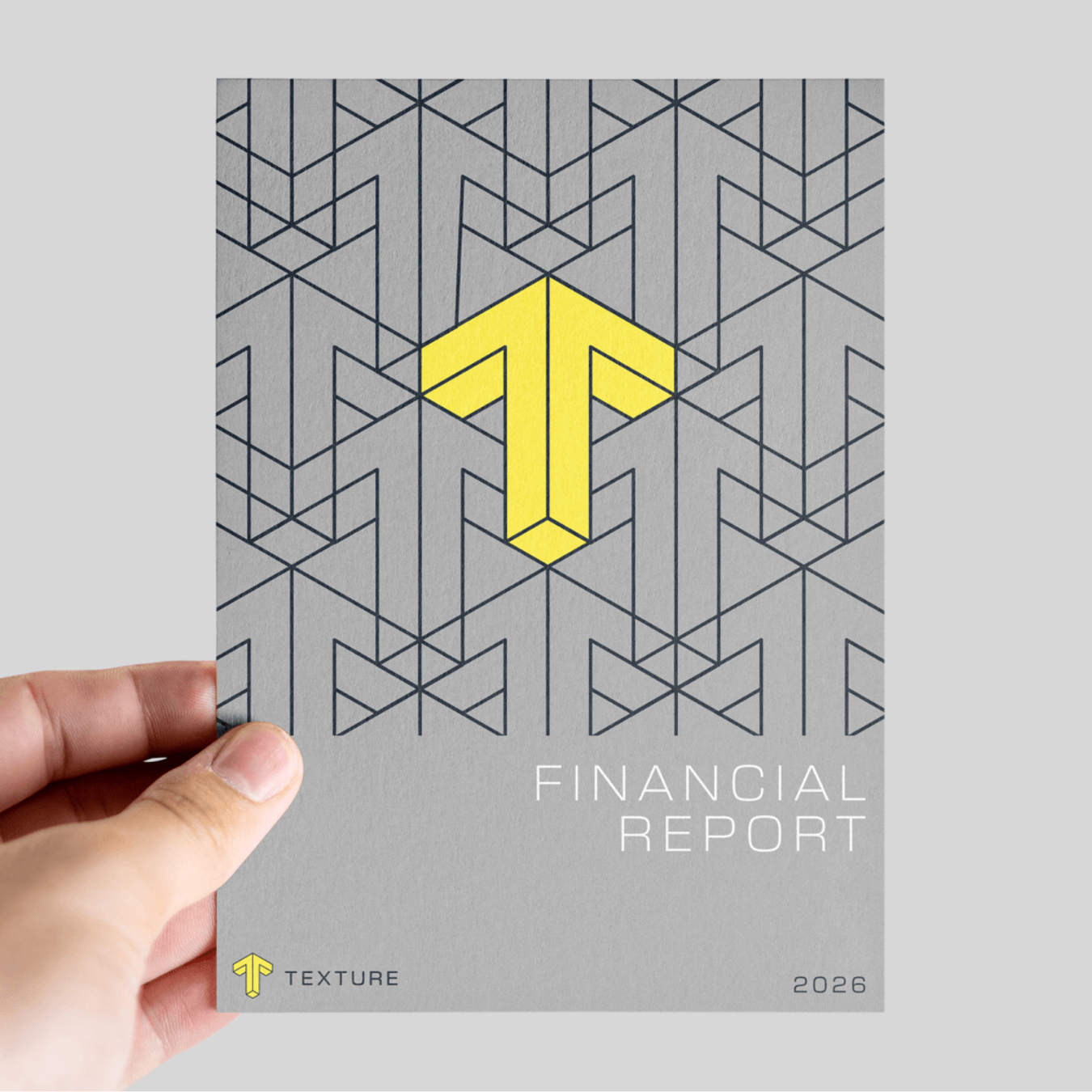
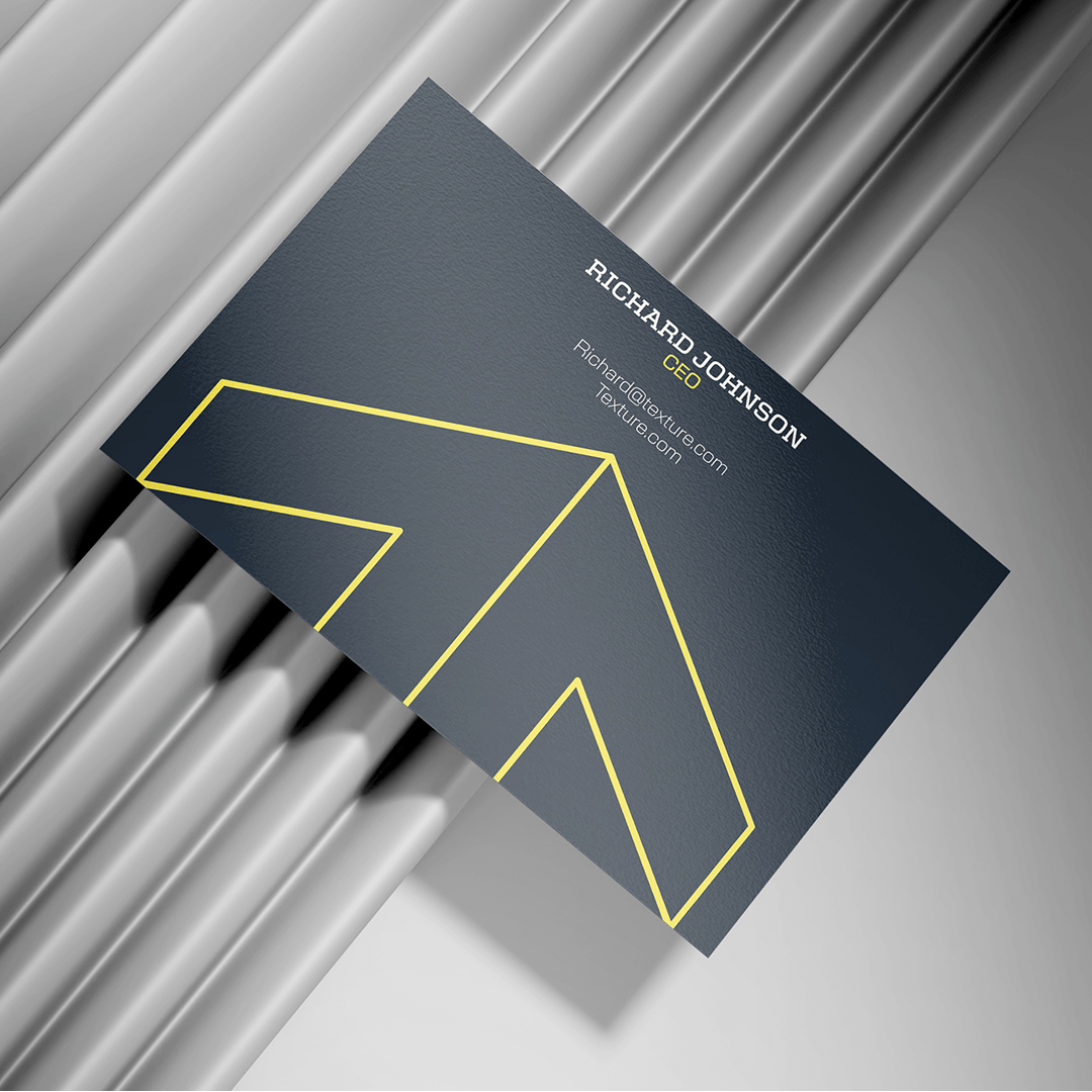
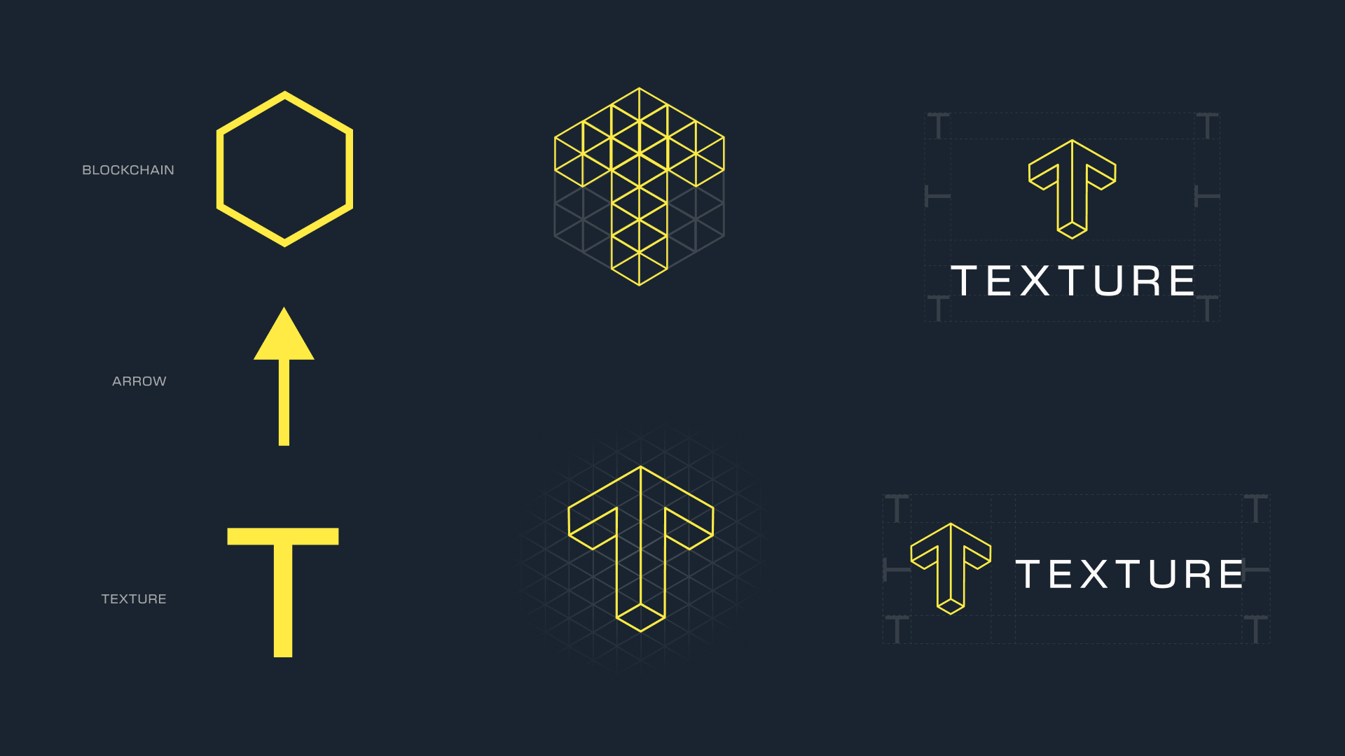
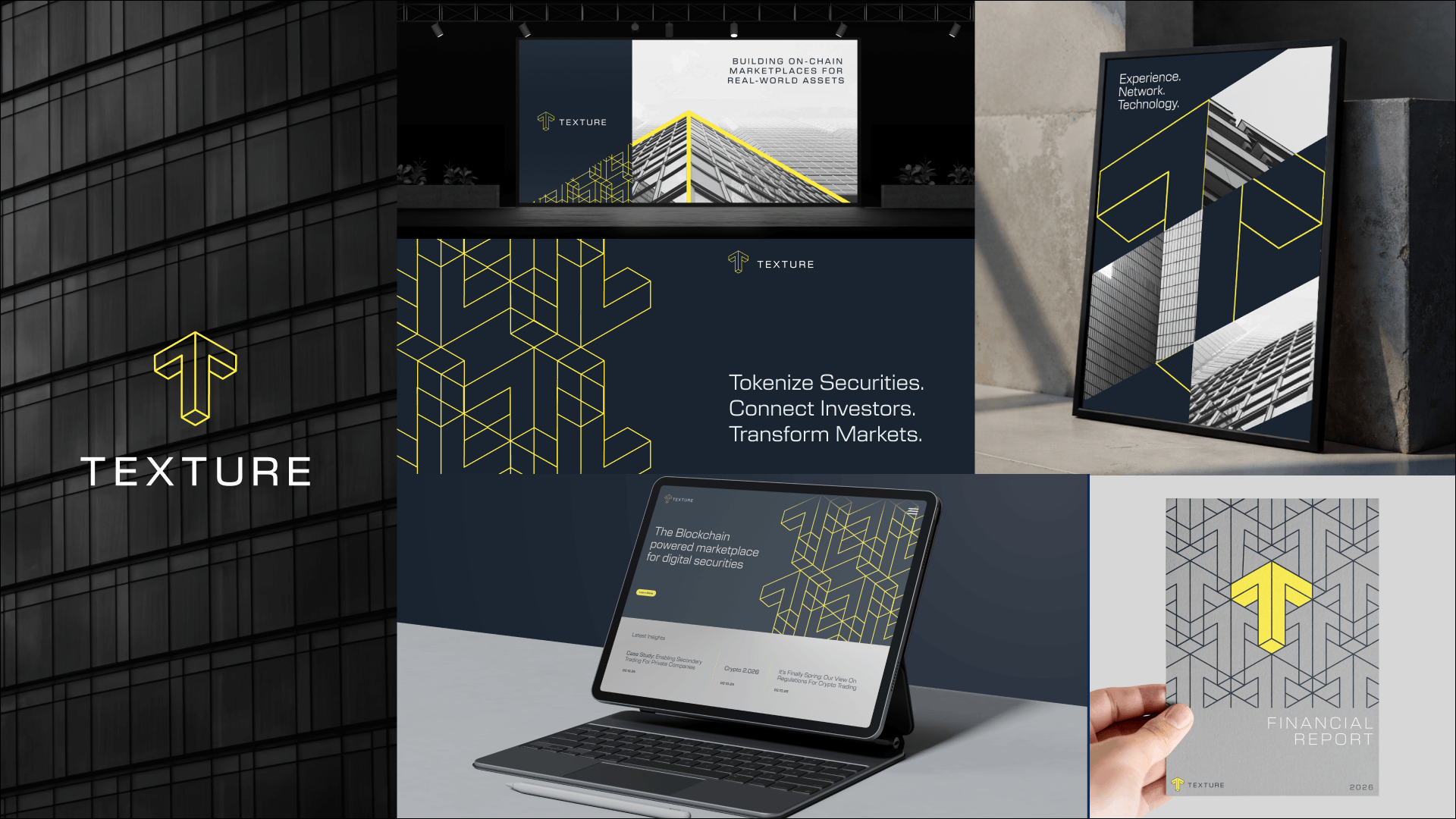
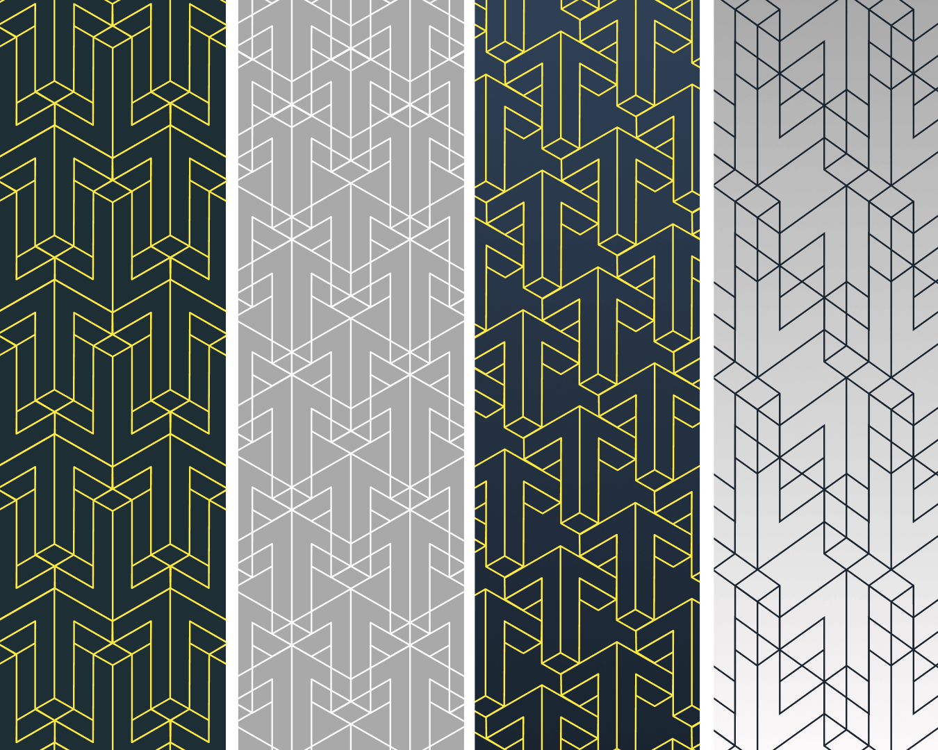
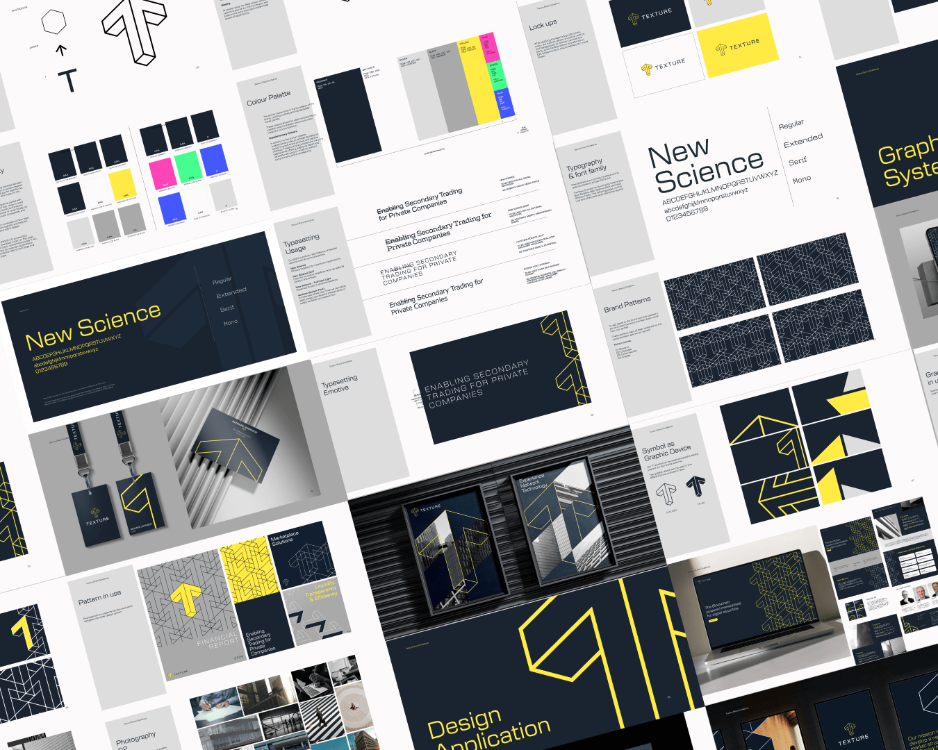
The identity takes the idea of texture literally. We redrew the wordmark to feel engineered and institutional so it holds its own next to the banks and exchanges Texture works alongside. Using the 'T' as a graphic device and a pattern built from fine, layered lines, it suggests the rows of a ledger with connection between traditional finance and the blockchain.
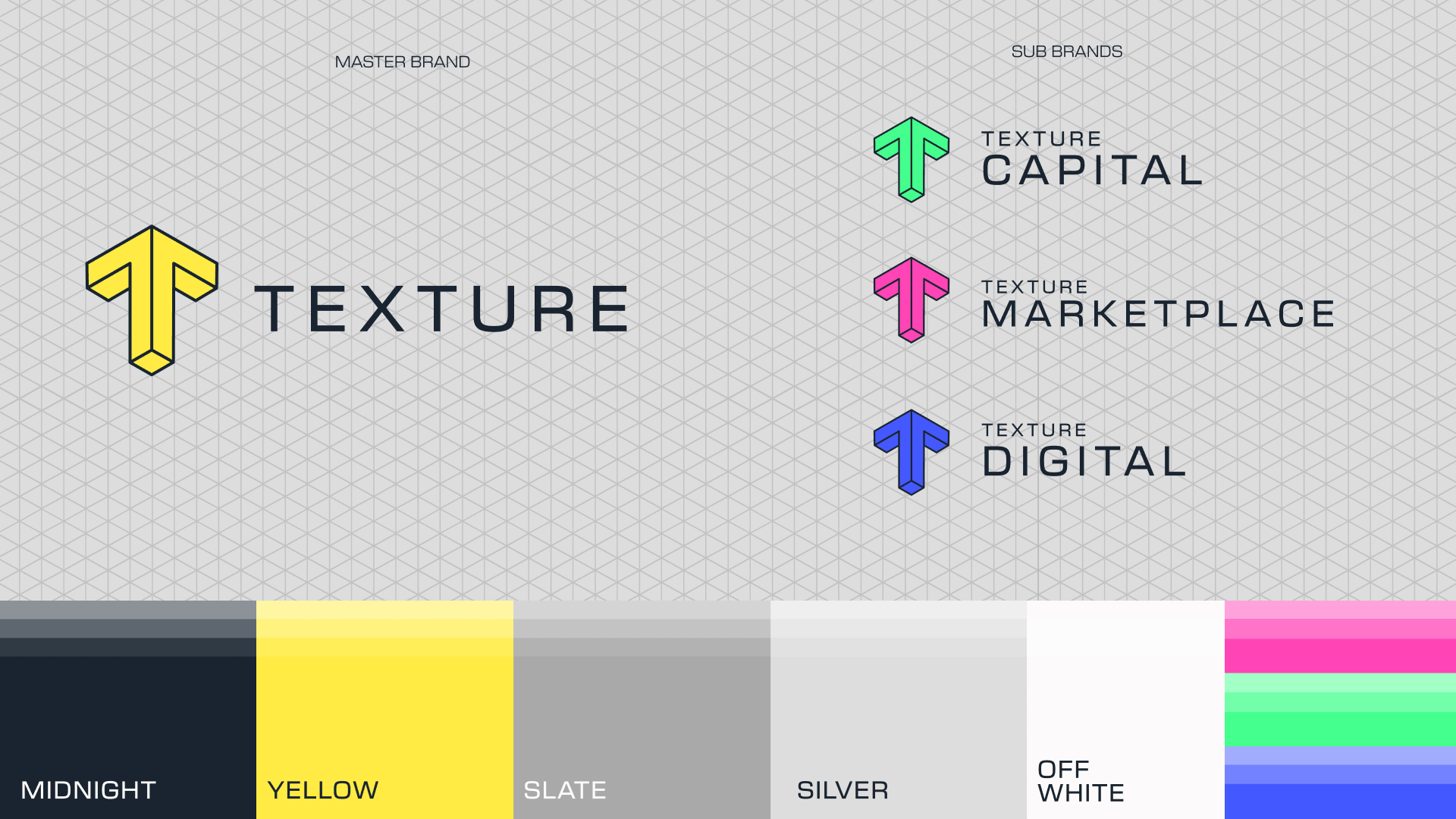
The palette pairs deep, grounded tones with a sharper accent, restrained enough for a regulated business while still feeling current. The New Science Typeface gives the brand a clean, technical voice that reads clearly from data tables to headlines.
Brand Expression
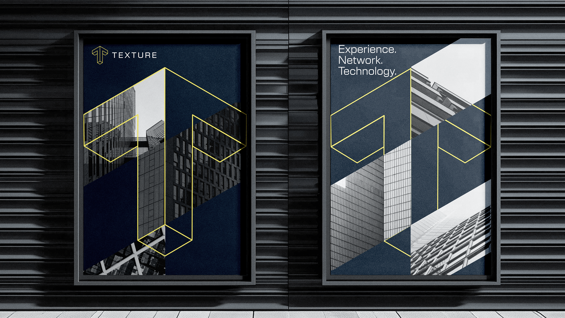
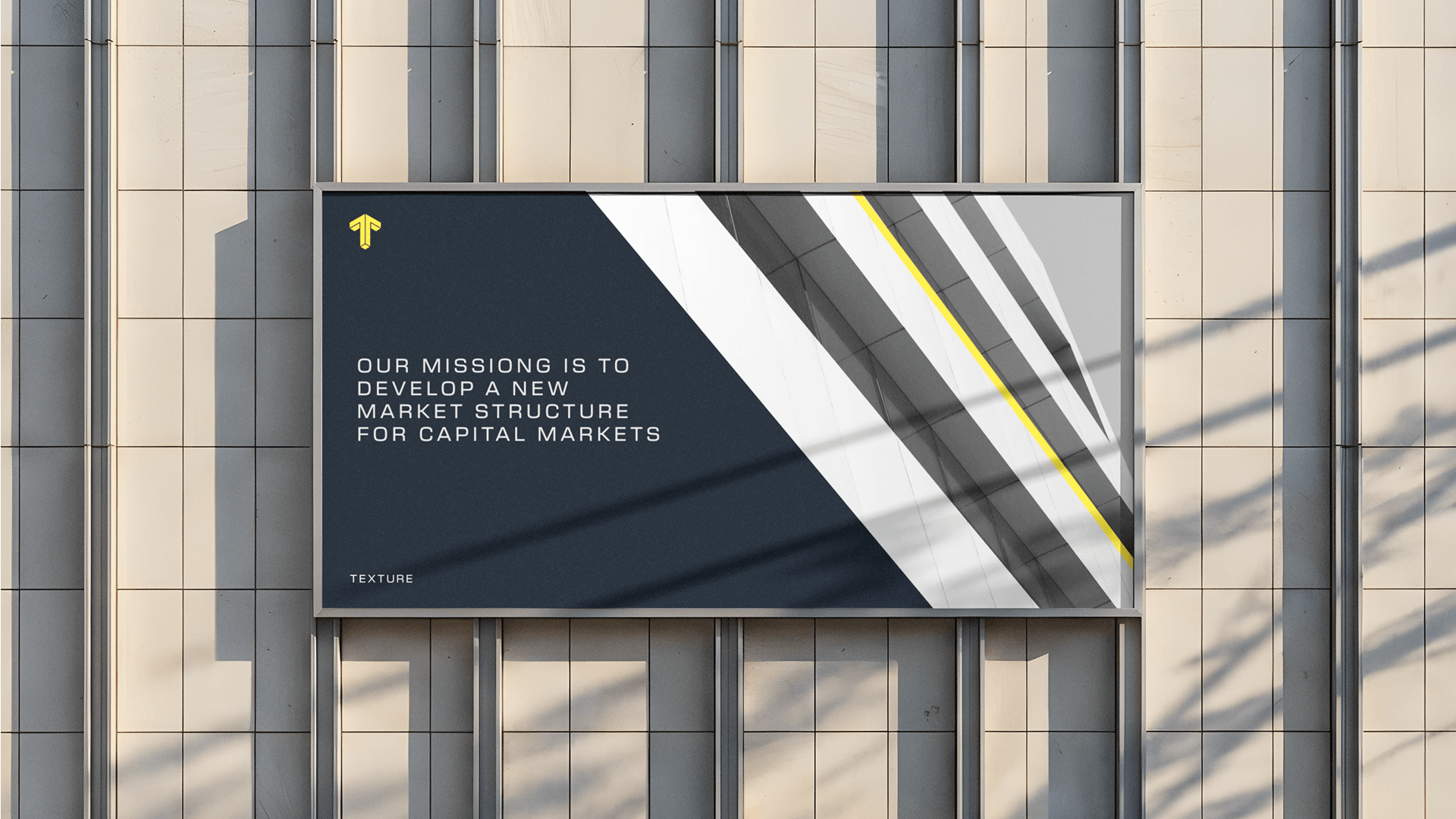
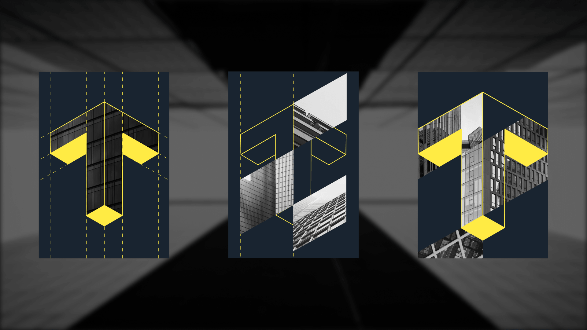
The brand system moves away from the visual language of the sector. In place of floating tokens and network diagrams, it uses a design system of isometric components that connect with the architectural and institutional photography of the finance sector, referencing traditional elements such as finance buildings, trading floors and offices after dark interconnected with the grid system itself.
The images suggest permanence and scale, and the pattern system generated by the 'T' texture sits over them to link the physical world of finance with what's being built on-chain. The result is a brand that feels established, not experimental.