


DeepSky
Brand Creation
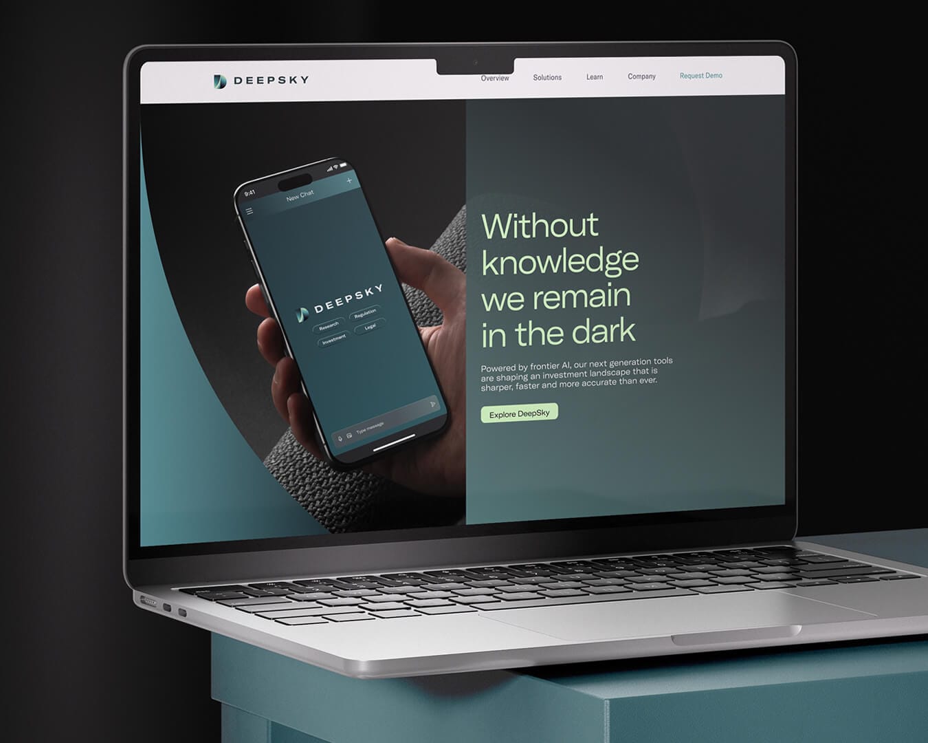
The Project
DeepSky approached Velvet Badger to help them transform from a promising AI start-up into a standout technology brand ready to scale.
DeepSky needed a clear strategy and visual identity to differentiate in a crowded market, unify their expanding suite of products, and tell a compelling story that investors, partners and users could really get behind.
Roles
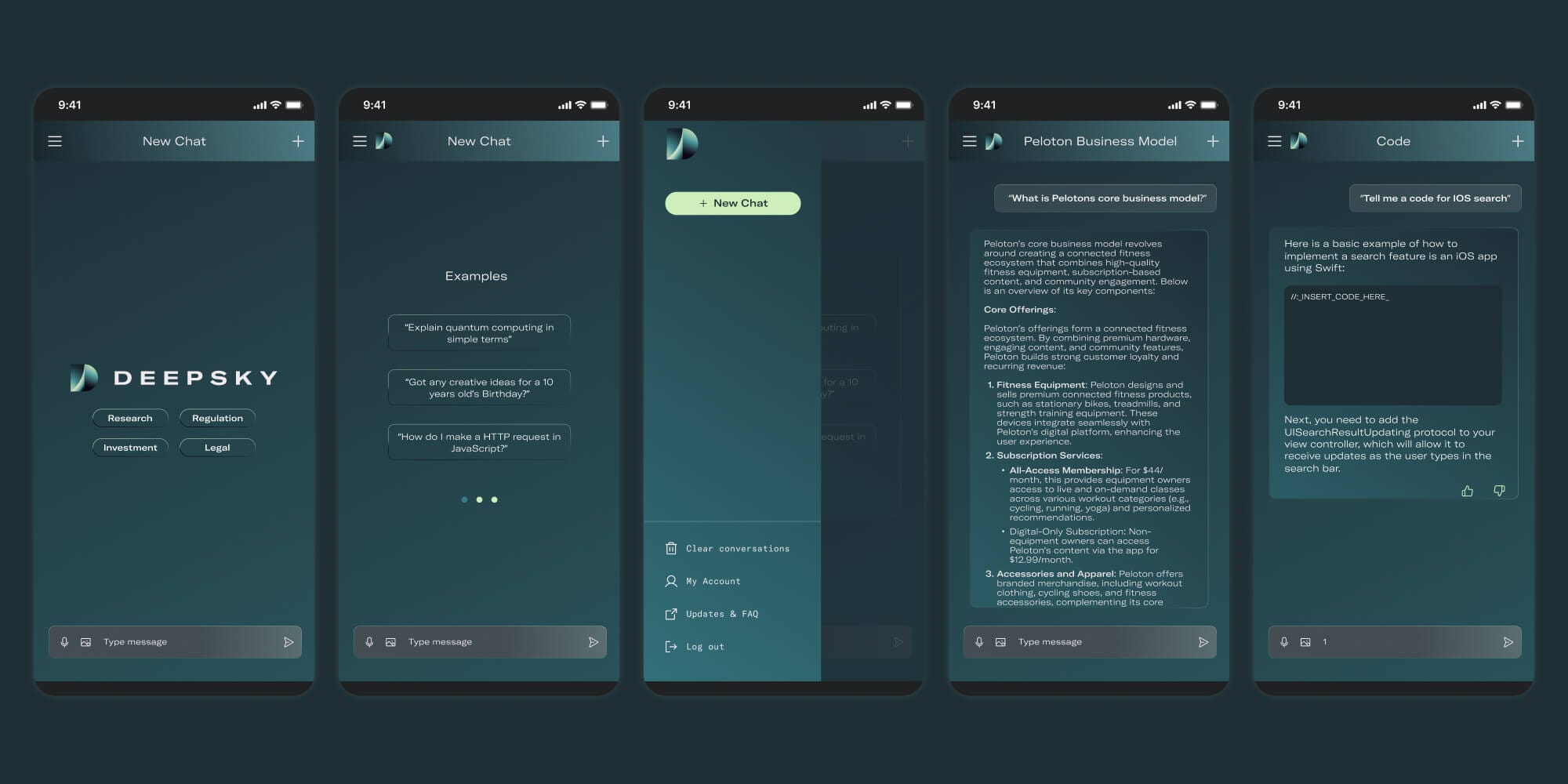
Nomenclature, Brand Strategy, Visual & Verbal Identity, Messaging, Digital Design, Product Intent
Challenges
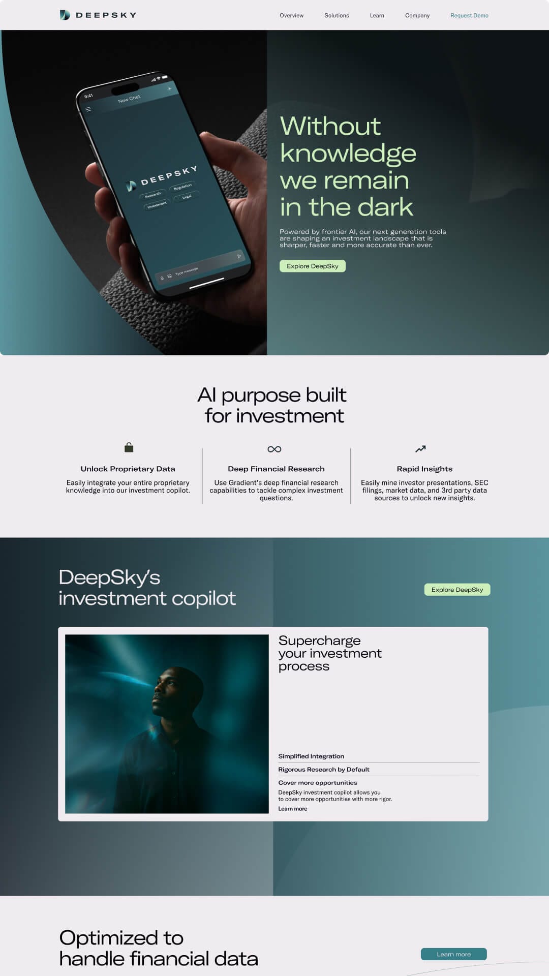
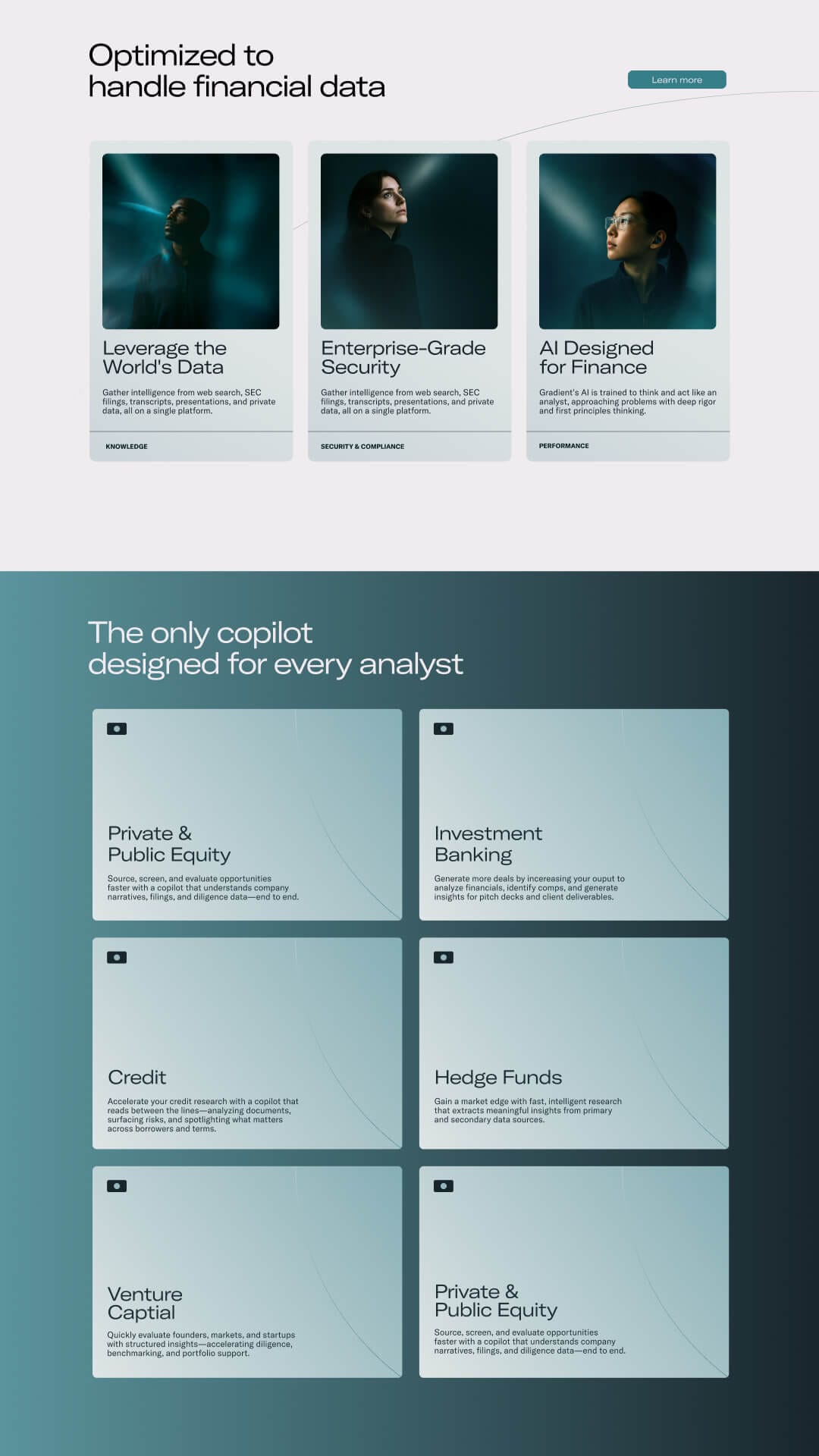
The first challenge was strategic clarity: how to bring structure to their business while developing the founders vision. The second was differentiation: how to stand apart from lookalike competitors in the AI space, most of whom lean on generic design and vague messaging. We also had to ensure the new brand could flex easily across digital channels, product interfaces, and future campaigns.
The Strategy
Our strategy started with listening. We ran in-depth sessions with DeepSky's founders and product leads to understand their vision, technology and commercial goals. From there, we mapped out a brand architecture that could expand as the business grew. Building out the naming conventions, tone of voice and messaging hierarchy to bring order to an ambitious roadmap.
We kept strategy, design and product thinking tightly connected. Our brand strategy work pinpointed what makes DeepSky unique and how to express that through copy, design and experience.
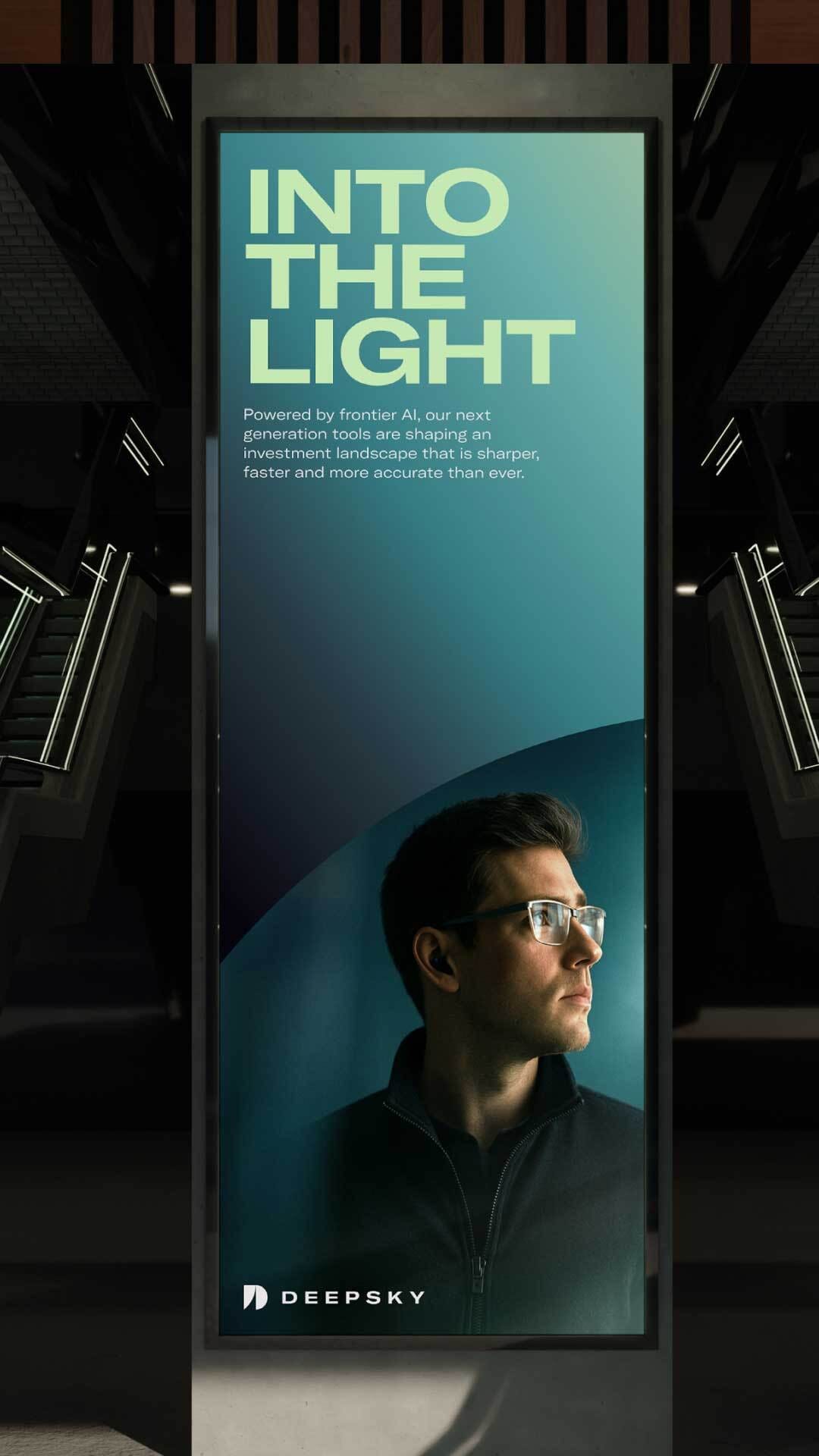
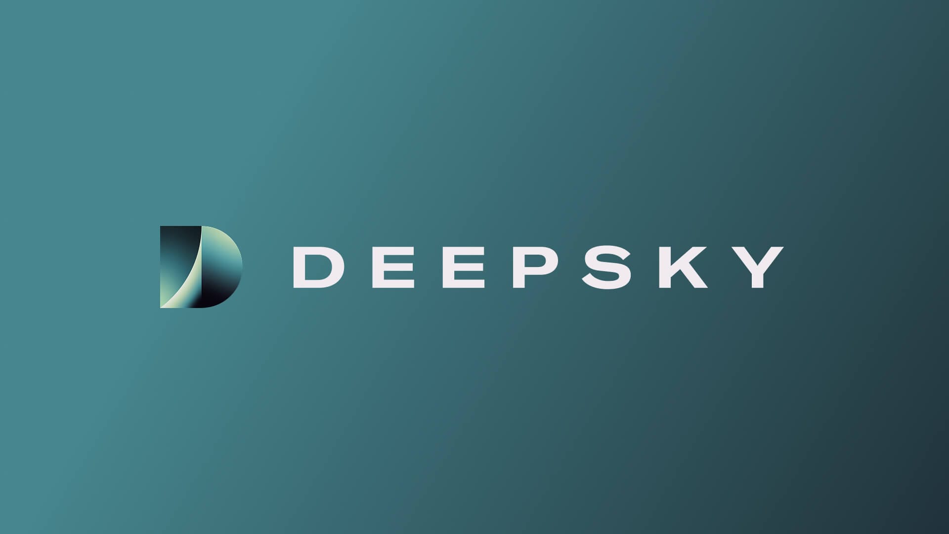
The name DeepSky was inspired by the 'deep sky' objects first catalogued by 18th-century astronomer Charles Messier as distant galaxies and nebulae that lie beyond what we can easily see. Just as deep space remains vast, exciting and largely uncharted, so too does the world of AI today. DeepSky captures the idea of looking further, revealing what's hidden and shining a clear light on the right path forward.
Visual
Identity
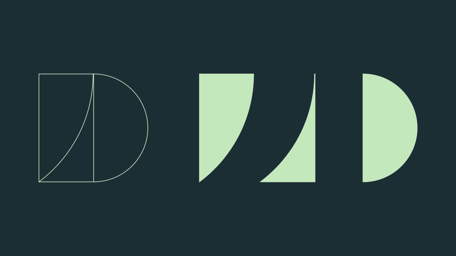
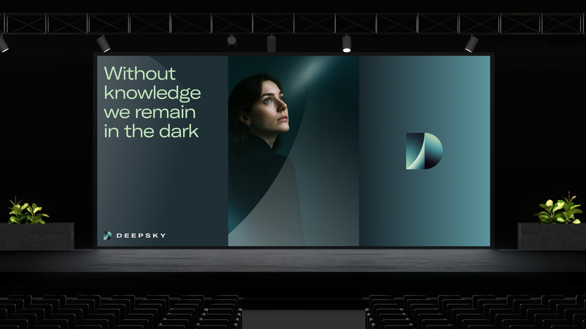
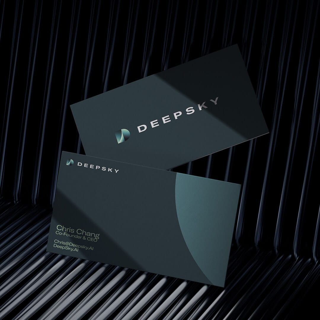
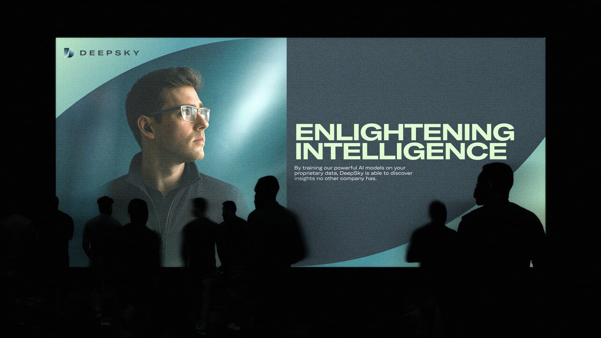
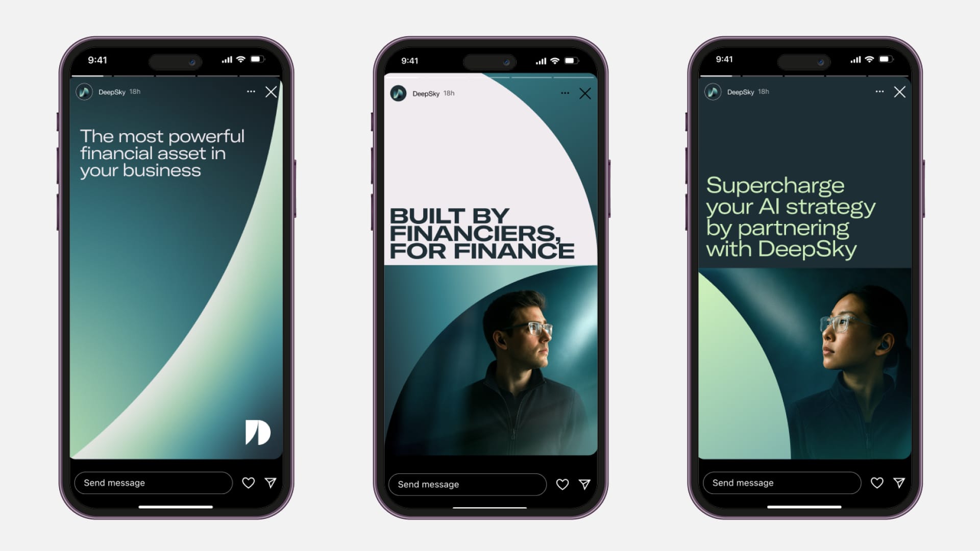
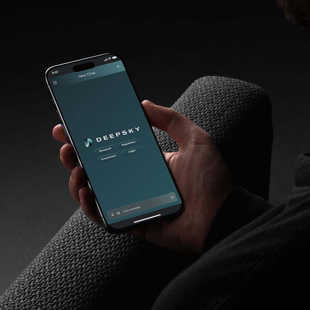
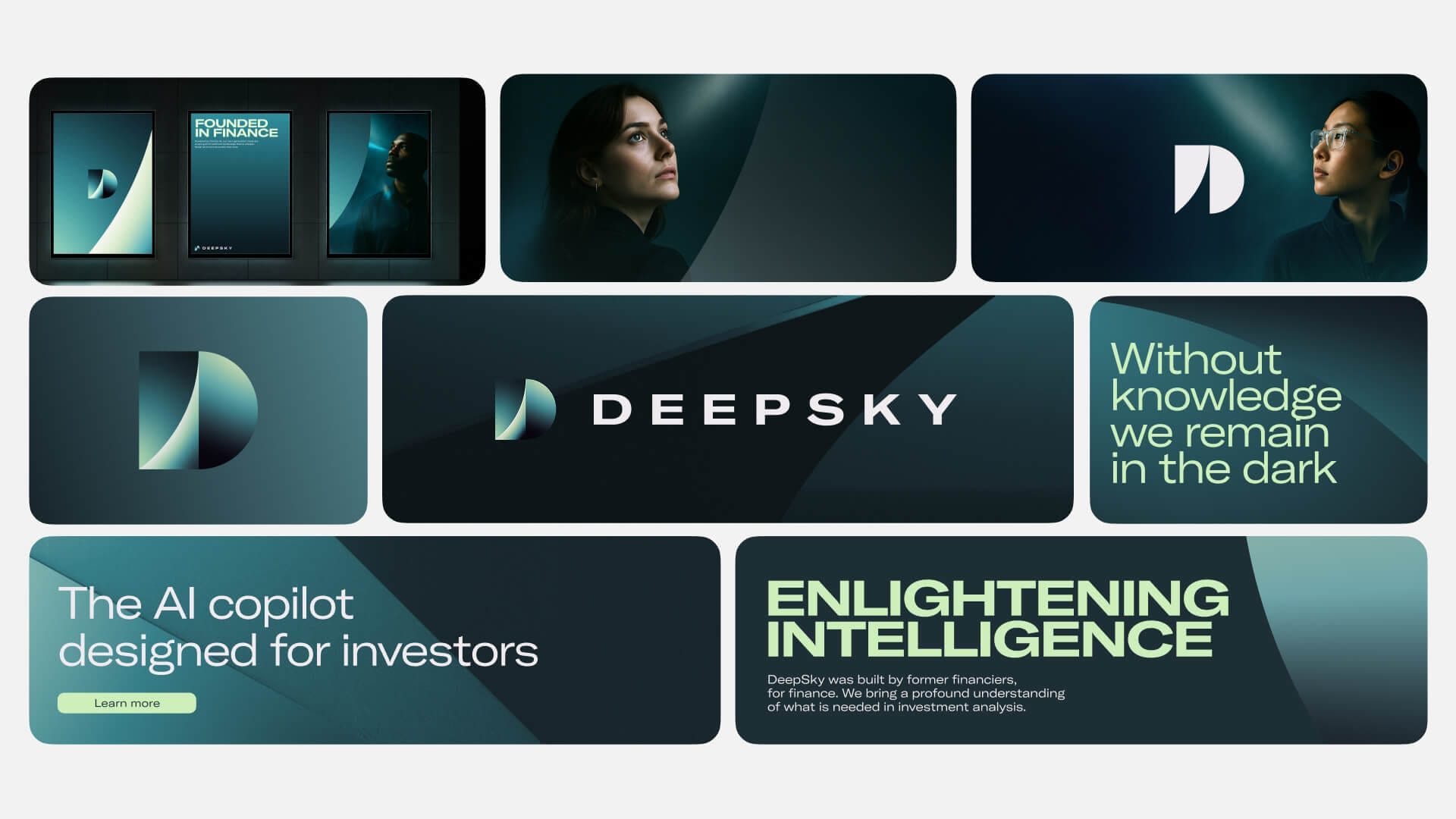
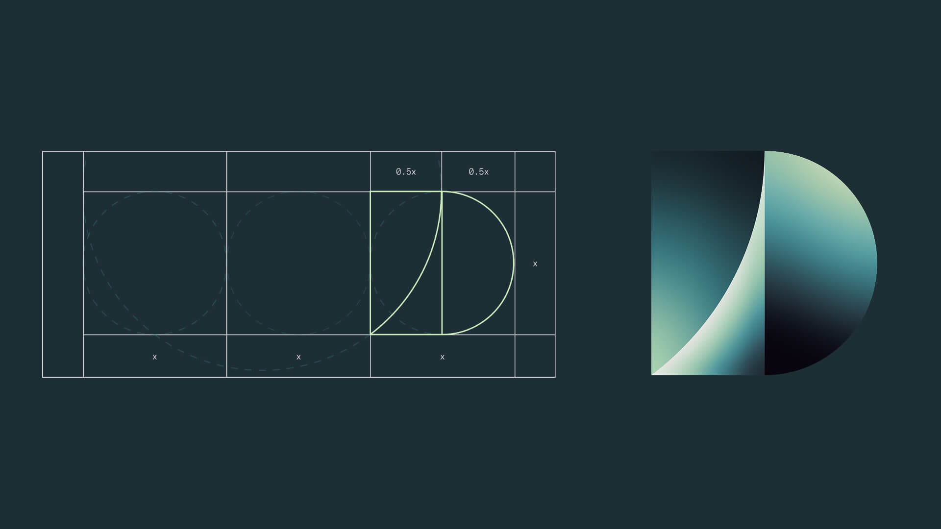
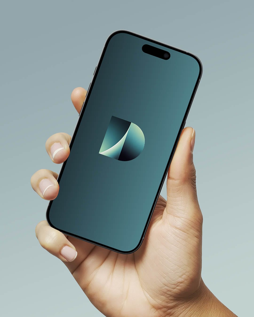
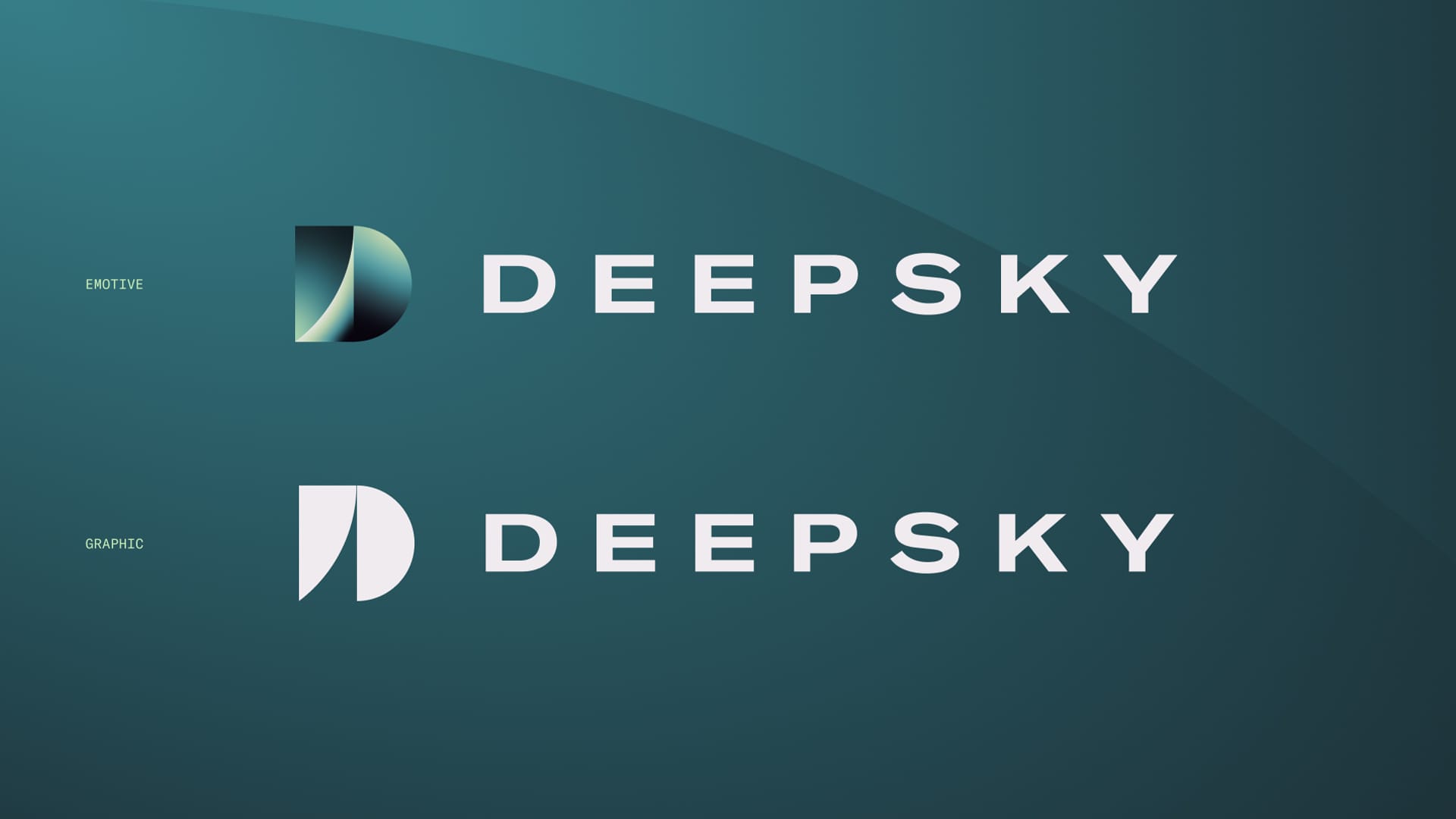
We designed the letter 'D' and shaped it with curves and gradients inspired by planetary orbits and shifting light. The cutaway and intersecting forms hint at the idea of looking deeper. It's a mark we wanted to feel expansive and technical yet human.
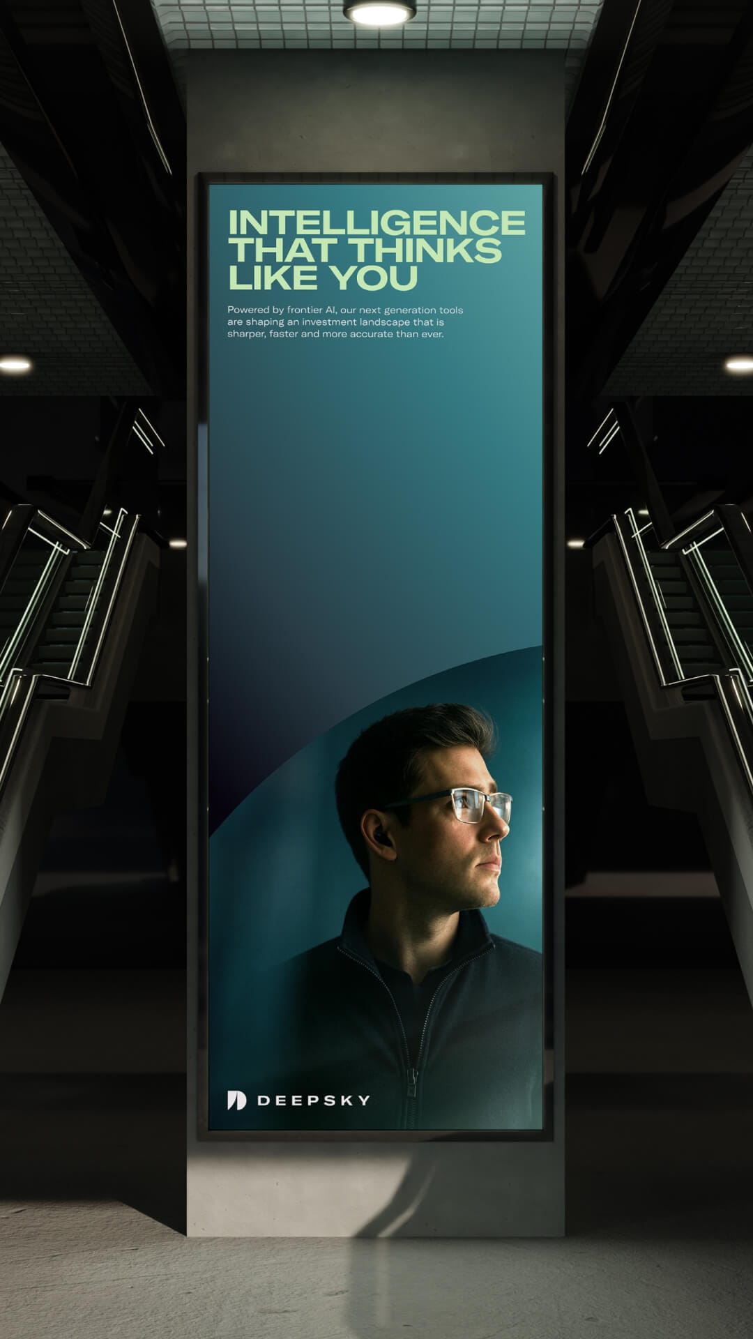
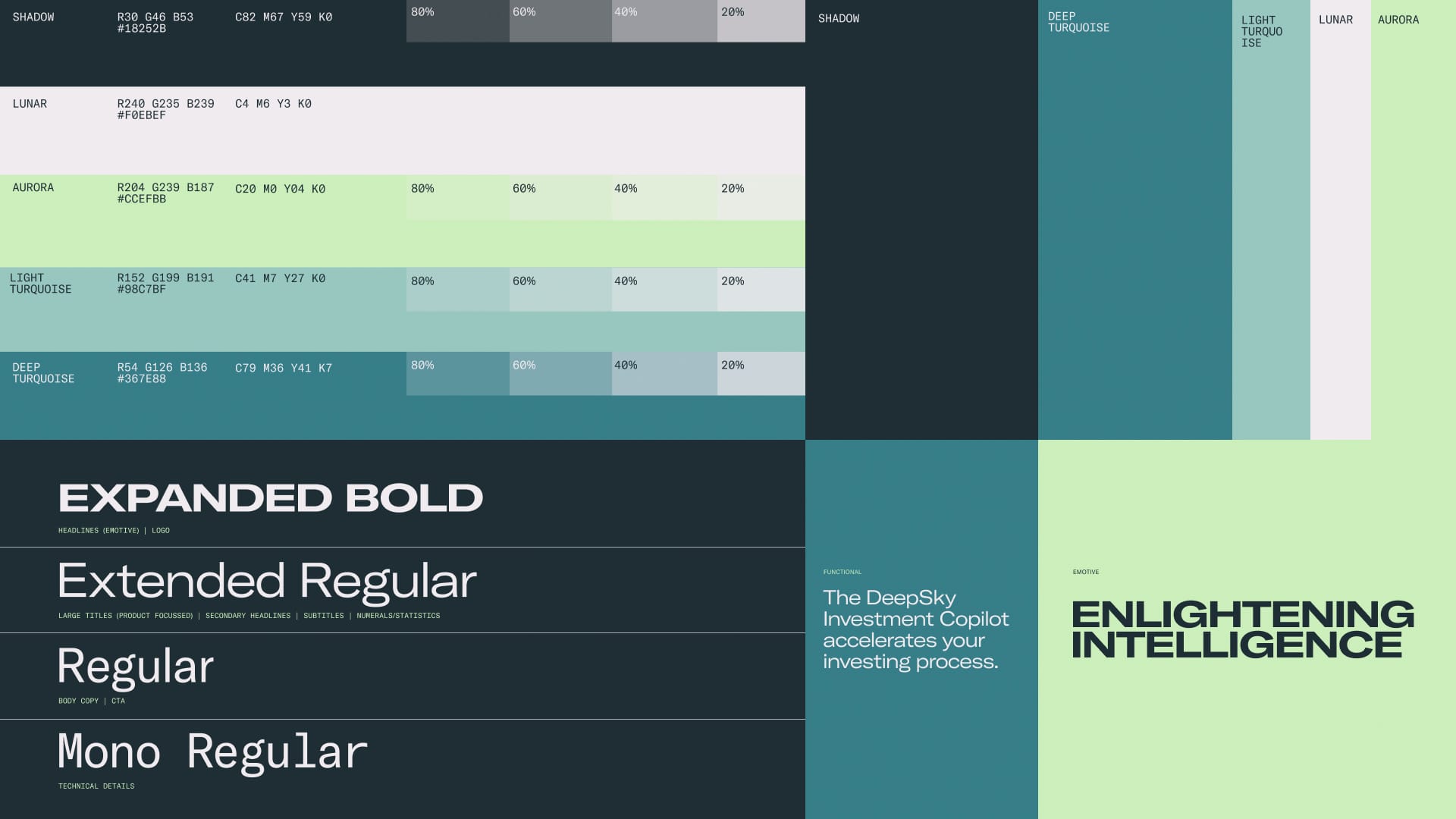
For typography, we chose GT America for its versatility combining a sense of technical precision with a expansive feel that echoes DeepSky's forward-looking strategy. The mix of extended caps and regular cuts lets the brand switch between emotive headlines and functional messaging.The colour palette balances deep, futuristic inspired tones like Shadow and Deep Turquoise with lighter, luminous shades like Aurora and Lunar, adding contrast and energy while hinting at the glow of celestial light against the dark unknown.
Brand
Expression
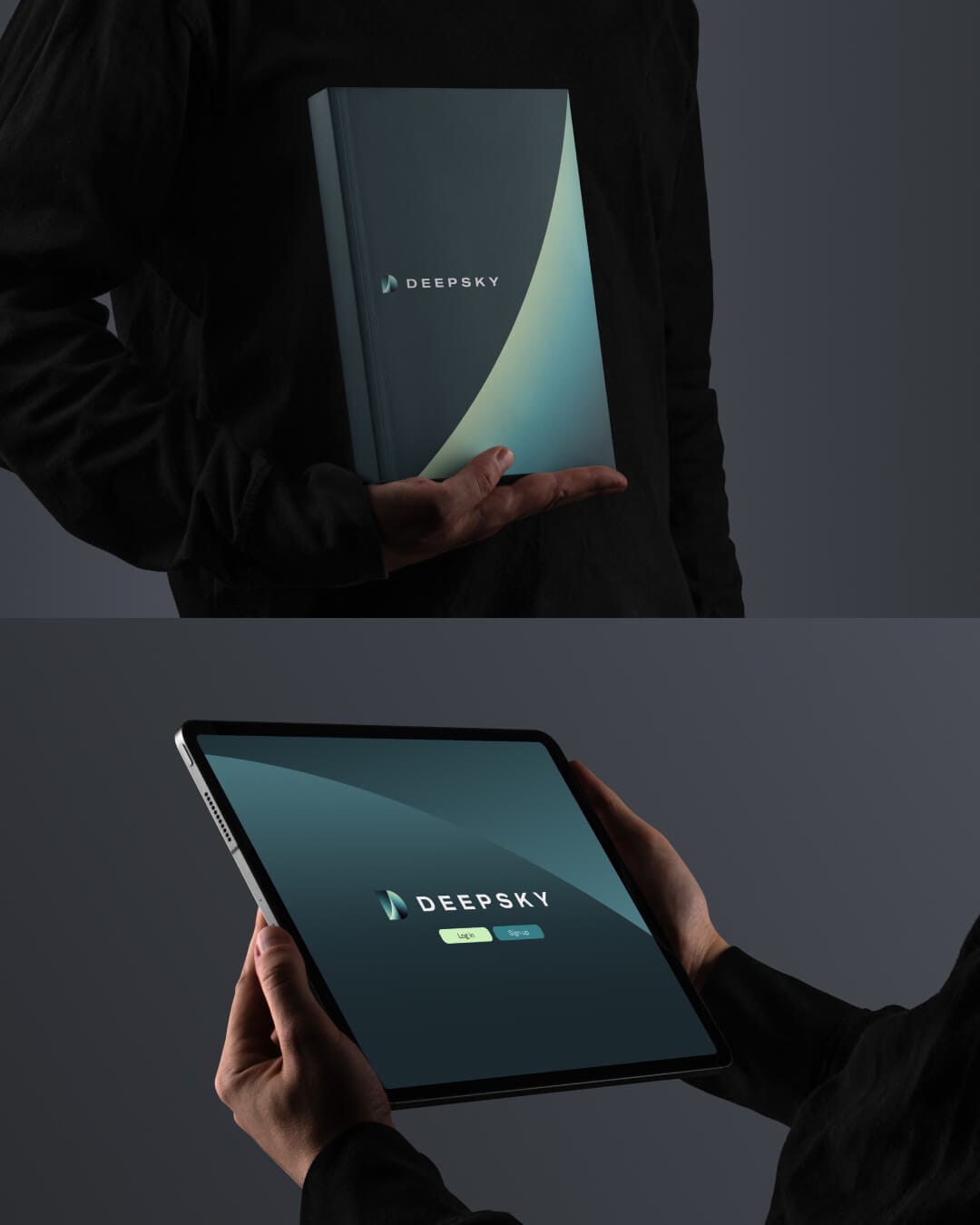
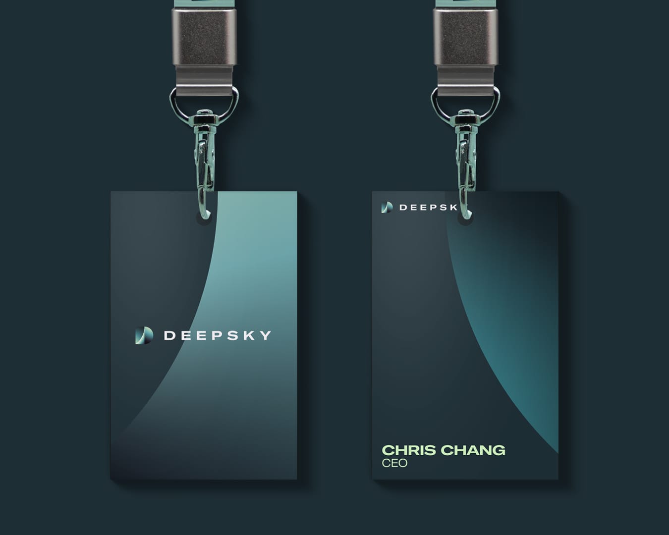
We used geometric cuts and curves taken directly from the 'D' to build a design system of graphic elements that flow across multiple applications, from digital interfaces to presentations and campaigns. This give the team a flexible visual language they can adapt deep into the product design itself. As new features, tools and interfaces come online, these elements stretch naturally across screens, decks and branded material.